What 29 stablecoin vaults actually delivered over 16 months vs what they advertised
 AlphaYields8 min read·Just now
--
An on-chain look at what depositors really earned, the gap between reported and realized APY, and the eight vaults that stood up to the data.
If you’ve spent any time depositing into stablecoin yield products, you’ve probably noticed that the number on the dashboard rarely matches the number you actually earn.
Sometimes the gap is small. Sometimes it isn’t. Either way, it’s hard to verify and almost impossible to fix unless you know where to look.
So we looked. Across 29 of the largest stablecoin yield vaults in DeFi, going back to January 2025. Not at what they advertised, but at what their on-chain share price actually delivered.
This is what we found.
The thing nobody talks about
DeFi yield products advertise APY. The user reads it, deposits, and assumes it represents what they’ll earn. It usually doesn’t, and the reasons are more varied than the standard narrative suggests.
Some aggregators annualize the last 7 days of yield activity. Yearn shows multiple windows side by side: 7-day, 30-day, or inception.
Morpho and Aave display instantaneous APY computed directly from utilization curves. DeFiLlama uses different methods depending on the protocol. Each captures something real about a vault’s current state.
The problem isn’t that any single method is wrong. It’s that none of them, on its own, tells you what you actually earned. Trailing windows lag when conditions change. Instantaneous APY swings with utilization. Multi-window displays leave the user to choose which number to trust.
The realized return, the number that actually shows up in your wallet, come from one place: the change in share price over the time you held the position. Everything else is an estimate.
We wanted to know how big the gap between estimates and reality was.
So we measured it.
How we did it
The methodology is replicable. The infrastructure underneath it isn’t trivial.
We index vault data ourselves across major EVM chains and a few non-EVM ones, with full history from each vault’s genesis block. For chains where public RPCs are rate-limited, incomplete, or lag on archival queries, we run our own nodes.
The index records deposits, withdrawals, TVL, harvests, rebalances, trading type, and security state block by block. Pulling 16 months of share price across 29 vaults isn’t a multi-day job for us. It’s a query.
This sets the eligibility bar.
A vault is included only if it’s verifiable end-to-end: strategy contracts reachable from the vault address, positions readable on-chain or via a verifiable oracle, and enough history to separate strategy yield from incentive yield.
We run pattern analysis on depositor flows to flag wash cycles and farm-and-dump rotations. We classify trading type into funding-rate carry, looped lending, delta-hedged LP, or basis trade.
We review admin keys, timelocks, oracle dependencies, and audit findings against deployed contracts. Vaults with opaque off-chain execution, unreconstructable losses, sub-threshold TVL, or unresolved critical issues didn’t make the cut.
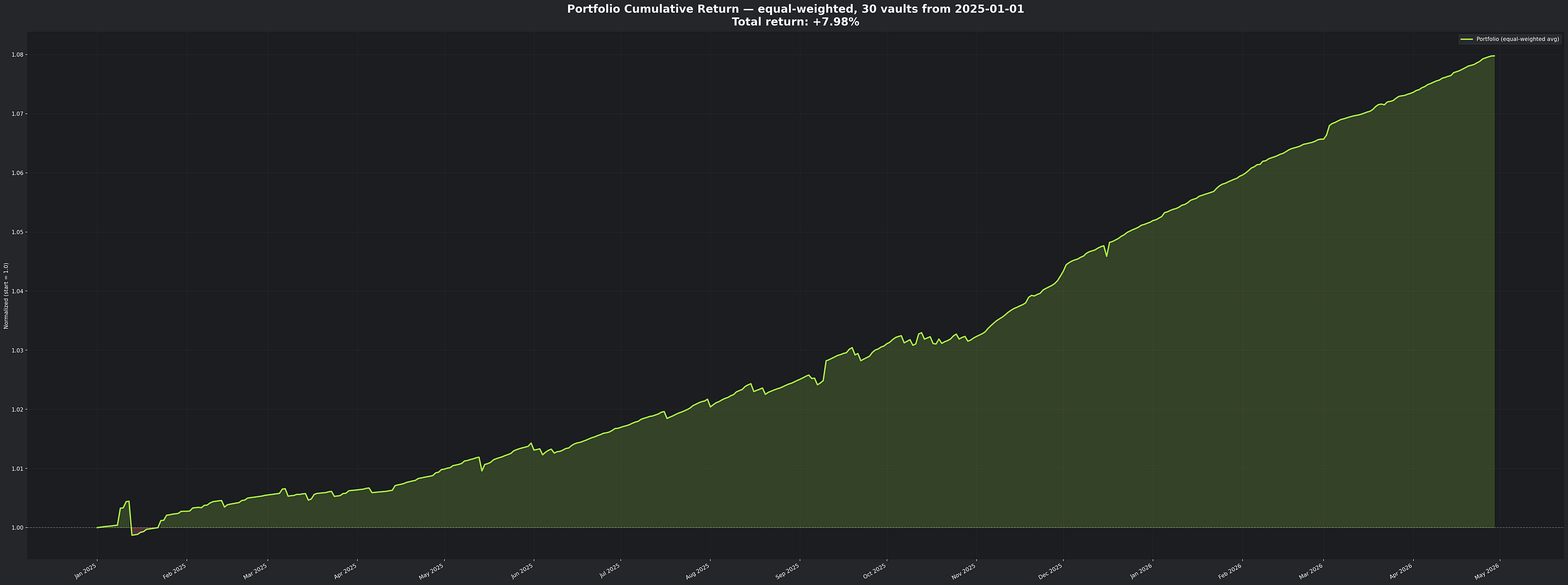
Once a vault is in, the measurement is straightforward. We pulled share price snapshots from January 1, 2025 onwards, normalized starting prices to 1.0, and annualized the change across whatever window of data each vault had.
Our index goes back to each vault’s inception. The visible chart trims everything before January 1, 2025 for readability. For vaults launched after that date, the annualized return reflects only the live window.
We didn’t extrapolate.
The visible density toward the right side of the chart reflects the wave of new vaults launched through 2025 and 2026, not a change in coverage.
We also computed an equal-weighted portfolio.
If you’d spread one dollar evenly across all 29 vaults on January 1, 2025, what would you have today?
That single number gives the cleanest answer to the depositor’s actual question.
The headline findings
The equal-weighted portfolio of all 29 vaults returned 7.98% over the 16-month period. One dollar in becomes $1.08 out.
The median 3-month annualized return across the same vaults is 6.7%. Some delivered far more, some less, but the typical vault sits in the single digits when you measure from share price rather than dashboard.
Many of these products advertise yields that imply higher numbers. The gap between advertised and realized isn’t a story about deception. It’s about a structural mismatch between how DeFi yield gets reported and what actually gets delivered.
The vaults that stood up
Eight of the 29 vaults delivered annualized returns above 10%. Three sat clearly above the rest:
• Tokemak autoDOLA at 33.1%
• Pocky’s High Yield USDS at 31.0%.
• cSuperior Quality Private Credit USDC at 15.3%
Below them, Syntropia Boosted at 14.2%, DeltaUSD HyperLiquid USDN Funding Arb and ETH Strategy Perpetual Note both at 13.8%, Resolv USDC at 10.7%, and Syntropia USDC Core at 10.4%.
That’s the entire top tier. Eight vaults, double-digit annualized returns, share-price-verified.
The remaining 21 clustered between roughly 5% and 10%. Some delivered solid risk-adjusted yield even at modest absolute returns.
Stablecoin vault share-price series are nearly monotonic, which makes traditional Sharpe ratios computed from share-price volatility unreliable for this asset class.
We’ll publish a separate piece on what risk adjustment actually looks like here, using drawdown depth, peg-loss tail risk, and smart-contract event frequency.
What separated the top performers
Three patterns showed up across the eight vaults that broke 10%.
Strategy diversity. The top performers combined multiple yield sources, like lending spreads alongside funding rate arbitrage, or options premiums alongside trading fees. Vaults dependent on a single source were more vulnerable when conditions shifted.
Longer track records. The vaults that performed best had typically been running for at least nine months before our window began. New vaults often show eye-catching APY in their first few months, when token incentives are richest and TVL is small enough to be easily managed. Sustained performance over a year is a different question.
Reporting alignment. The vaults whose advertised yield came closest to what depositors actually earned tended to compute APY directly from share price appreciation. The fix isn’t complicated. It just isn’t standard yet.
The vaults that fell short
We’re not naming the underperformers individually, because vault performance is contextual. A vault that delivered 5% over our window may have delivered 12% in a different window. Markets change. Strategies change.
The most common pattern among the lower performers was a heavy dependence on token emissions or points programs to drive headline APY. When those programs decayed, and they always decay, realized share price growth slowed dramatically. The dashboard kept showing the old number for weeks. The depositor saw something different.
The vault wasn’t lying. The aggregator wasn’t lying. The mechanics of how DeFi yield gets reported simply produce numbers that don’t always match what gets delivered.
A note on what we excluded
One vault was excluded from this analysis.
Its share price showed extreme behavior at the very end of the window, computing to a 307% annualized rate over its 183-day track record. That kind of move is almost certainly a contract migration, an unusual reward distribution, or a data artifact rather than realized yield. We left it out and will revisit it separately.
A marketer would have used the 307% as the headline. We didn’t, and we’re telling you why.
How we used this analysis
We’re publishing because the analysis is useful, and because the space gets better when this kind of work is public. But we didn’t do it for purely altruistic reasons. We use this data internally to make decisions about where to deploy capital.
The same indexing infrastructure that produced this analysis powers vault selection inside ayUSD, our stablecoin yield product live on Flow EVM, with cross-chain deposits routed via LayerZero and planned expansion to Ethereum, Arbitrum, and Base.
When we built ayUSD’s allocation, we needed to choose which underlying vaults would receive capital. The choices weren’t made by reading dashboards. They were made the same way the analysis above was: share price verified across long windows, eligibility filtered against the criteria we just described.
Three of the five vaults in ayUSD’s launch allocation appear in the top tier of this dataset:
• Pocky’s High Yield USDS at 31.0%.
• DeltaUSD HyperLiquid USDN Funding Arb at 13.8%.
• ETH Strategy Perpetual Note at 13.8%.
The other two, Curve LlamaLend on Arbitrum and a Morpho vault on Base, have shorter track records but consistent share price growth. We accepted shorter histories in exchange for diversification across chain, strategy, and underlying protocol.
The point isn’t that ayUSD’s allocation is perfect. It isn’t, and we’ll keep refining it. The point is that the allocation is defensible because it’s grounded in the same kind of analysis you’ve just read.
If you want to push back on a specific choice, the data is sitting right here.
What we’re not claiming
Past performance does not predict future returns. The 16-month window includes specific market conditions that won’t hold forever. A vault that delivered 15% over this period may deliver less in the next.
Some vaults have shorter track records than others. We’ve handled this by annualizing only over the window each vault actually existed. Per-vault data ranges are in the appendix.
Share price analysis isn’t perfect either. Some vaults externalize part of the depositor return through deposit fees, withdrawal delays, or token rewards distributed separately from share price appreciation. We’ve flagged these where they apply. Where they don’t, share price is the cleanest signal available.
What comes next
This becomes a recurring bi-weekly publication. The chart you saw is a snapshot, but the underlying data updates continuously.
Publishing it bi-weekly gives the community a reference point; a steady look at what stablecoin yield is actually doing instead of what it claims to be doing.
If you have feedback on the methodology, push back. If you spot a vault we missed, name it. If you replicate the analysis and reach different conclusions, share them.
The space gets better when more people are looking at the share price and fewer are looking at the dashboard.
That’s the whole argument.
Follow the work on Twitter at @AlphaYields_AI.
Disclaimer: This article is for informational purposes only and does not constitute financial advice. Yield in DeFi is variable. Past performance does not guarantee future returns. DeFi strategies carry inherent risk including smart contract risk, market risk, and counterparty risk. Always do your own research before depositing capital.
Appendix: full vault list
The thing nobody talks about