Mastering StandardScaler, RobustScaler, and PowerTransformer with Python and Scikit-Learn.
Numerical feature engineering is an important pre-processing step in training ML models.
While handling numerical data, there are 2 major issues to tackle. One is the magnitude of the features and the other is the outlier.
Say for eg: When we are handling 2 different features that are completely in different ranges such as age and salary, it is essential to make these features comparable. If not, the model might think salary is more important just by the magnitude of the feature alone.
Another important issue is that many of these features can have a skewed distribution ie most of the values are small but there are few massive “outliers”. For eg: say we have a feature indicating the number of siblings. While most of the values can be between 0–2, few outliers such as 8 or 10 can highly skew the distribution. In some cases, we can ignore the outliers and drop those data. But in most of the cases, these outlier do give useful information and cannot be easily ignored.
Some of the common techniques used to handle them are
- Standardization
- Robust scaler
- Power Transformer
- Normalization
To understand these transformations better, we will consider the California housing dataset from scikit-learn. We consider two features “Median Income” and “Population” that are on different scale.
dataset = fetch_california_housing()
X_full, y_full = dataset.data, dataset.target
feature_names = dataset.feature_names
df = pd.DataFrame({
    "MedInc": X[:, 0],
    "Population": X[:, 4],
})
df.describe()
+---------+------------+-------------+
| Metric  |   MedInc   | Population  |
+---------+------------+-------------+
| count   |     20640  |       20649 |
| mean    |  3.870671  | 1425.476744 |
| std     |   1.899822 | 1132.462122 |
| min     |   0.499900 |           3 |
| 25%     |   2.5634   |         787 |
| 50%     |     3.5348 |        1166 |
| 75%     |   4.743250 |        1725 |
| max     |    15.0001 |       35682 |
+---------+------------+-------------+
The original data without any scaling or transformation is shown below. We show the full data with outliers and without outliers (0–99th percentile)
X = X_full[:, [0,4]]

outlier_range = (0, 99)
cutoffs_median_inc = np.percentile(X[:, 0], outlier_range)
cutoffs_population = np.percentile(X[:, 1], outlier_range)

non_outliers = np.all(X > [cutoffs_median_inc[0], cutoffs_population[0]], axis=1) & np.all(
        X < [cutoffs_median_inc[1], cutoffs_population[1]], axis=1
    )
non_outlier_X = X[non_outliers]
non_outliers_Y = y_full[non_outliers]

fig, (ax1, ax2) = plt.subplots(1, 2, figsize=(12, 5))
fig.suptitle('Original Data')
ax1.set_title('Full Data')
ax1.scatter(X[:, 0], X[:, 1], c=y_full)
ax1.set_xlabel('MedInc')
ax1.set_ylabel('Population')

ax2.set_title('Non-outlier Data')
ax2.scatter(non_outlier_X[:, 0], non_outlier_X[:, 1], c=non_outliers_Y)
ax2.set_xlabel('MedInc')
ax2.set_ylabel('Population')
plt.show()

Lets see how each of the techniques mentioned above transforms the data and helps in better training of the model.
Standardization
Standardization transforms numeric values into a particular range with a zero mean and unit variance.
For eg: A difference of “10” in Age is tiny compared to a difference of “50k” in income. The model will ignore the Age because the “income” signal is much louder.
So we standardize these values with a mean 0 and a unit variance. As a result all the features will be transformed into a comparable range.
The standardization or the z-score is usually calculated as
z = ( x — mean ) / standard_deviation.
Usually, these standardized features play well with algorithms that assume a normal or bell shaped distribution of input features like Linear Regression, Logistic Regression and Support Vector Machines along with dimensionality reduction techniques such as PCA.
In Sci-kit learn, the standardization can be applied using StandardScaler. Let’s see how our data is transformed with StandardScaler.
standard_scaler = StandardScaler()
standardized_x = standard_scaler.fit_transform(X)

Originally, the Population ranged between 0 to 35k and the medianInc between 0 to 14. After standardization, they are both re-scaled to [0,35] and [-2,6] making them comparable.
However, one major drawback with standardization is that they are highly influenced by outliers. For eg in th above figure we can clearly see that, while the maximum value is rescaled from 35k to 30, due to the outliers, the mean still reamins significantly higher. As a result most of the data is being squished into a smaller range between [-1,4].
Thus it doesn’t actually change the shape of the distribution. ie if the data was skewed it will continue to remain skewed even after standardization.
But on the other hand, we can see that most of the data is now in a comparable range between [-2,4] for medianInc and [-1 to 4] for population.
Robust Scaler
A slight alternative to standardization is Robust scaler, which is immune to outliers. As we saw in standardization, when an outlier is too large, standardizing with mean and unit variance can drive up the average and give negative result. To overcomer this, we can use robust scaler which uses median and inter-quantile range (usually between 25th and 75th quantiles). Since we are using inter-quantile distances, the scaled values are not influenced by a marginal number of outliers.
It is to be noted that similar to standardization, the outliers are still present. However, the features fall within more comparable ranges.
roubust_scaler = RobustScaler(quantile_range=(25.0,75.0),
    with_scaling=True, with_centering=True, unit_variance=True)
robust_x = roubust_scaler.fit_transform(X)
The default quantile-range is (25,75). While this is customizable, the default range which ignores the extreme 25% on both the ends is what makes it “Robust ”to the outliers.

Here we can see that most of the data for both the features fall within more comparable ranges of MedInc: [-2,5] and Population: [-2,6] range.
While both StandardScaler and RoubustScaler transforms features into a comparable range, they do not completely mitigate the effect of outliers. To overcome this, we need to use non-linear transformations such as Log Transformation, Power Transformer or Quantile Transformer.
We will see one such transformation below.
Power Transformer
In most real-world datasets, like income, house prices etc, most of the values are small but there are few outliers which are large. Models such as linear or logistic regression try to draw a line that minimizes the distance to all points. In such cases, a single massive outlier acts like a heavy weight on one end of a see-saw, tilting the entire line and ruining the model for everyone else.
Moreover, even in neural networks which can handle a variety of data, a single massive outlier during a training step can skew the weights. This when combined with a comparatively larger learning rate can cause a massive jump in your loss landscape.
PowerTransformer helps us to overcome this by taming the tail of the distribution. It makes non-normal data look more like normal distribution.
It transforms the distribution by bringing the values of the outliers closer to the rest of the group. As a result, it physically pulls the long tail in, changing the skewed distribution into something like a bell-shaped curve. This ensures that the outliers are retained without skewing the models.
In sci-kit learn, transforming the data into normal can be done either using PowerTransformer or QuantileTransformer.
To understand them better, lets vizualize the long-tail in out population feature.
Visualizing the long tail:
plt.figure(figsize=(12, 4))
sns.boxplot(x=df['Population'], color='skyblue')
plt.title('Box Plot of Population (Visualizing Outliers)')
plt.xlabel('Population Value')
plt.axvline(1425, color='orange', linestyle='--', label='Mean: 1425')
plt.legend()
plt.show()
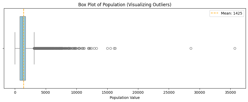
We can see from the box-plot that the “box” represents the bulk of our data (the interquartile range), while the long string of dots to the right represents the extreme population values that can “tilt the see-saw” of our model.
Lets apply the PowerTransformer and see how the data changes.
from sklearn.preprocessing import PowerTransformer

pt = PowerTransformer(method='yeo-johnson')
pt_transformed = pt.fit_transform(X[:,[1]])
To understand the effect, lets plot the histograms for population before and after.
import matplotlib.pyplot as plt
import seaborn as sns
fig, (ax1, ax2) = plt.subplots(1, 2, figsize=(15, 6))
sns.histplot(standardized_x[:,1], ax=ax1)
ax1.set_title("Before: Standardized Population (Skewed)")
ax1.set_xlabel("Value")
sns.histplot(pt_transformed[:,0], ax=ax2)
ax2.set_title("After: PowerTransformed Population (Normal-like)")
ax2.set_xlabel("Transformed Value")

plt.tight_layout()
plt.show()
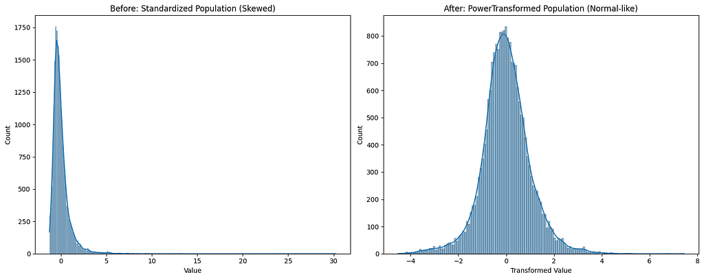
We can clearly see that the PowerTransformer has converted the feature distribution into a normal-like distribution.
Moreover, when we look into the before and after box-plots, we can clearly see that, even after standardization the bulk of the data is still on the left with a long tail. However, with PowerTransformer, we can see that the box is more centered with symmetrical whiskers on both the sides.
fig, (ax1, ax2) = plt.subplots(1, 2, figsize=(15, 5))
sns.boxplot(x=standardized_x[:,1], ax=ax1)
ax1.set_title('Standardized Population\n(Scale changed, outliers remain)', fontsize=13)
ax1.set_xlabel('Z-Score')
sns.boxplot(x=pt_transformed[:,0], ax=ax2)
ax2.set_title('PowerTransformed Population\n(Shape changed uniform tails)', fontsize=13)
ax2.set_xlabel('Transformed Value')

plt.tight_layout()
plt.show()
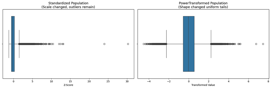
In the standardized plot, the one on the left, we can see that the values are spread out over a larger range. So, when a linear regression predicts a wrong value on the outlier, the square error will be huge. As a result, the model will try to pull the line towards the outlier. In doing so, it screws the fit for the remaining bulk of the data.
On the other hand, on a normally distributed data, like the one on the right, the outlier are not massive and are not miles away. They are closer to the remaining data. As a result the errors are always balanced and allows the model to make correct predictions on bulk of the data.
On comparing, standardized MedianInc and PowerTransformer applied Population,
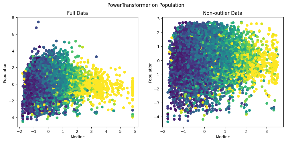
We can clearly see that, unlike standardization, the outliers are brought close to the existing group of data. Also, we can see that the data is nicely distributed without being squished within a tiny range. This is clearly evident in the highest MedianInc block of 6, where the population values range between [-4, 2]. This allows the models to easily understand the nuances in the data and detect the relations between features.
Normalization
Another important numeric feature engineering technique is the normalization, which rescales all the data within a range of 0–1.This is necessary because certain distance based algorithms such as KNN are sensitive to absolute numbers.
Vanishing Gradients: Also, in neural networks, large values (say age value of 99) can easily saturate the activation functions. As a result, the gradients will be almost close to zero and the model will stop updating its weights and will eventually stop learning. Normalization solves the vanishing gradient problem by res-scaling the values between 0–1. This creates a sweet spot for most activation functions allowing the model to learn.
The most common technique of normalization is Min-Max scaler given by
x_norm = (x — x_min) / (x_max — xmin).
However the major drawback of normalization is that, given a single large outlier say an income of $1 billion dollars, normalization will set the $1 billion dollar equal to 1 and try to squish all the other values based on this. As a result most of the data falls within a tiny range and the input will lose all its nuances.
Lets see the effect of normalization in our data.
min_max_scaler = MinMaxScaler()
nomralize_x = min_max_scaler.fit_transform(X)
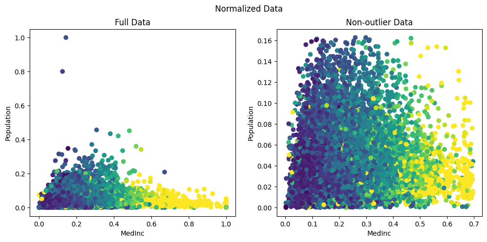
As we can see, Min-Max scaler has set the highest value for population to 1.0. It has then squished almost all the data within a range of 0–0.16. This is because, from the box-plot above we saw that the maximum value extends until 35k while the bulk of data was between 1000–2000. As result, the min-max scaler has set 35k to 1 and has tried to squish all the other meaningful data into a tiny range less than 0.2 .
Therefore, normalization is best suited when we know the boundaries of input feature say a pixel value in a RGB image, which can only range between 0–255.
To conclude, here is a table that summarizes the different scalers.
.----------------------.---------------------------.-------------------------------------------------------.
|        Issue         |         Best Tool         |                         Why?                          |
:----------------------+---------------------------+-------------------------------------------------------:
| Different Scales     | StandardScaler            | Makes features comparable.                            |
:----------------------+---------------------------+-------------------------------------------------------:
| Heavy Skew           | Power/QuantileTransformer | Normalizes the distribution shape.                    |
:----------------------+---------------------------+-------------------------------------------------------:
| Extreme Outliers     | RobustScaler              | Uses Median and IQR, unaffected by marginal outliers. |
:----------------------+---------------------------+-------------------------------------------------------:
| Neural Network Input | Min-Max Scaler            | Matches the "expected" range of neurons.              |
'----------------------'---------------------------'-------------------------------------------------------'
A final word of caution in using these scalers, we fit() only on the training data.
.fit(): Calculates the mean and standard deviation. Only do this on Training Data.
.transform(): Applies the math. Do this on both Training, Test and production.
Why? If we fit on our test data, it is "cheating" and leads to “data leakage” . This is because the model "sees" the distribution of the data it's supposed to be tested on.
Also, it is imperative that when deploying the models, we need to ship the scaler parameters as well.
References: https://scikit-learn.org/stable/auto_examples/preprocessing/plot_all_scaling.html
Taming Outliers and Skewed Data: A Guide to Numerical Feature Engineering was originally published in Level Up Coding on Medium, where people are continuing the conversation by highlighting and responding to this story.


